Hey Everyone,
It’s time for an update on how skill trees are progressing after a first round of user feedback!
- People tend to agree that all the various nodes are spread out well
- It was generally understood the flow of tree and how it worked
- The number of each kind of node (active, passive, stat) seemed reasonable
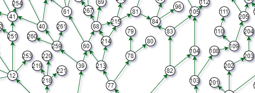
- The skill tree was very hard to take in visually using the format presented for the survey
- There were a wide variety of ideas of possible builds that people wanted to try

The last point was great to see - the entire point of the tree being designed with nodes of the same skill being spread out was to encourage hybrid characters builds with no single skill they rely on alone. Overall from feedback it appears people are receptive to this idea, though it is still entirely possible to focus on a single skill if that is how people want to play. With that said we are happy with the initial feedback in this regard.
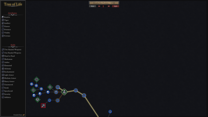
Lastly, we expected people to not be happy with the visual looks of the tree used in the survey. This was a simple mockup used only to convey the content. However we did get some good feedback on suggestions visually where to go and this was used to inform the current concept art for the skill tree.

To help with the various kinds of nodes, we decided to make use of different shapes as well as color. Each skill or stat now has an associated icon to help clearly show what each kind of node on the skill tree represents. The players already selected nodes are highlighted and connected with a white line. The possible choices are shown with an orange line, and the full node path is shown with a gray line.
Some more things that need to be worked on are filters to find specific kinds of nodes, as well as determining everything that goes into the detailed stats pane. We have some initial ideas for that and we will be back in part III to discuss that.
As always thanks for your support and we'd love to hear any feedback you have. If you want to keep up with the latest news, make sure to subscribe to the newsletter!
-The EoS Team


